Logo Help

Vertago

Poster Extraordinaire
=(e)=
Joined
Jul 10, 2010
Messages
3,157
So I am trying to come up with a logo for a group I am in.

Here is a very basic design that I created:

h9zb2NT.jpg


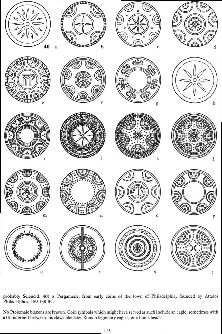
The idea behind it is that it is supposed to be a sorta of greek aegis shield as the group name is "Aegis Initiative" I would like to keep the greenish and purple colors but make them have a more grungy look.

Examples:
logo-shield.png


shield_designs.png


Greek Design: http://imgarcade.com/1/ancient-greek-designs/

https://www.google.com/search?tbs=s...mILwCg&ved=0CDcQsw4&biw=1440&bih=775#imgdii=_
 
I'll see what I can do.. what does the symbol in the middle mean... about?
 
I'll see what I can do.. what does the symbol in the middle mean... about?

Like Eternal said, It is the empire logo of the Vanu Sovereignty which is one of 3 factions in the game Planetside 2.

Here is a non-deformed version of the same logo:
gFKq2YJ.png


Also I was thinking, instead of using the zigzags for the circular border of the shield. Would it be possible to use these symbols? (See below)

Gxf5Rr6.jpg


Ya98AVn.jpg


xcfPxX7.jpg


kzoAHPc.png


As for the color of the shield, I'd say black would be best. Since the symbols are neonish.
 
Last edited:
Hmm.. interesting idea.. i could probably do that. (Rune Symbols)
 
duhhh .. should've read more detailed lol .. didn't catch the part with the shield :( sorry .. I ll try something else
 
Very Cool, 808-Stat3! IMO I think these 2 look best but need some slight modifications.

I love the unique design for this one but could it be made to be more shield like? and have the "Vanu Logo" stand out a bit more without a shadow. Also in regards to the Vanu logo, in all of your designs it seem very pixelated around the edges, maybe a black glow instead of a white glow would fix that?
[hiddenbox]
su08.png
[/hiddenbox]

The Lens Flare in the middle seems out of place. I really like the background but the vanu logo does not seem to blend in well. Also is there a way you could bevel out the logo to make it have a more shield like look? And maybe add an outside border to the overall circle.
[hiddenbox]
yd0y.png
[/hiddenbox]

Also would it be possible to make two versions of each? One with the text "Aegis Initiative" and one without.

Thank you very much for your time in making these!
 
Last edited:
Wow Tom, I really love your work. Looks amazing!

Sent from my SM-G900V using Tapatalk
 
After staring at it for a few mins, I have a few comments, nothing too big.

  • I love how you put "Aegis Initiative" in the sides of the logo. what font is that?
  • IMO, The purple parts of the logo in the middle does not contrast to well on the black behind it. Maybe a slight green border would help?
  • Sorta same issue with the hieroglyphics on the border. Purple on purple, I'm not sure what color would look better.
 
Wow...I have no more issues with it. TBH better than I envisioned it...

I will compensate you somehow...
 
sorry I got caught up with therapy .. hope you got your logo the way you need it ;) Aloha ;)
 
Tom here are some comments from the group this logo is for:

CuteBeaver: "Omg this is fantastic <3 I would so buy this as a decal without a second thought."

DasPeople: "That looks pretty damn good."

Botep: "Love it. Give that man a raise."

Lemgar: "Can you get a version without the lighting effects?"

RahkZar: "I agree, at least a reduced lighting effect. I think it's too strong, otherwise I really like it."

1upking: "My only comment is about the glare. I like it, but it might be just a bit too bright at 3 and 9 o'clock.

Other than those that, this looks awesome."

PlatanusO: "Agreed. Besides the lighting effects though I would be totally okay with this if we wanted to make it the the 'official' logo."

Testacles VS: "Tha'ts awesome! It's always really cool to see someone else take your idea and make something badass with it <3. Hats off to your friend!"

Prosium451: "I love the design but it's too shiny as is."
 
Last edited:

Latest posts

Back
Top