EdgeGamers New Identity


edgebluelighter.png


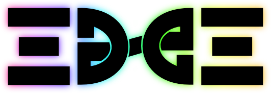
<div style="width: 500px; text-align: center" align="center">We are very excited to present eGO's new logo to the community. This has been a project the Community Manager team has been working with Versed on over the past few weeks. The final product can be seen across the board on all of our Social Media services and will be added to our website in the coming days.

The icon itself spells out EDGE and has a star in the middle to bring the brand together. The star has been a part of EdgeGamers Organization since the start and it only made sense to add it in. The shape is modeled after our tags =(eGO)= to keep that consistent feel without current members and audiences feeling we detracted from our roots.

We will be releasing a kit to our members in the coming weeks to allow everyone access to our new logo.

<hr width=500>
If you were interested in ordering a t-shirt with our new logo - you're in luck. We have updated our Zazzle store with designs to cater to each persons preference available on all of their apparel options.

Visit our store below and select the style you most prefer. Once you have opened the style you will be able to select from the product you would like to order.

Orders placed tonight can receive 20% by using the promo code REASON2CHEER.

ZAZZLE.COM/EDGEGAMERS*
</div>
 
Last edited:
Sorry to say, I'm not a fan of the new logo.

I can't see any resemblance to the word "EDGE" and to be completely honest, there has hardly been any mention of a 'star' in our tags, or eGO itself.
 
To add also to the note,

Rather than just putting it across the opinions of the leadership for the designs 'look' and 'feel'. I'd have appreciated seeing a vote being cast out for the logo- of a do you like it? yes/no e.t.c to get a generalised view from the community:O.
 
I'm not really a fan of the new logo. I loved the old one and this one just doesn't do it for me. :huh:
 
not a huge fan of it but not bad either. The designer probably did put a great deal of thought to make it unique. I will give it thumbs up on creativity.
 
It's a good design, but not for eGO. Doesn't seem to fit, but humans are reluctant to change.

I wonder how rank logos could be created for such a design. Probably impossible to do, so I guess the rank logos will stay in conjunction with this one? If that's so, it doesn't fit at all.

No worries, Shiznoe. I found it.

43adb0c8aa.png


Really hard to see the EDGE in the logo, but that's because three of the four letters are backwards. (If this isn't how EDGE is in the logo, then I don't know how it can possibly be in there unless it's Shiznoe's way.)
 
I'll be totally honest. Until shiznoe and kazzo posted, I could not figure out how edge was in the logo.
 
To clear the air for those who may not have been at the clan wide meeting. The purpose of this logo is not to spell the word EDGE. Seeing the word EDGE is a secondary attribute to the logo. If you see it, great, if not, that's okay too.

The logo is meant to represent our in game tags that have been a part of the history of eGO since it was founded. As for the start that Nicoll's points out (see what I did thar?) you can view the previous logos here: http://www.edge-gamers.com/forums/showthread.php?t=75961

As you can see it has been a part of the image of eGO since its founding. The five point start represents power in many cultures throughout the world. It has been used in many different flags and military designations to represent that power.

The logo is meant to stand along or with the typography it was created with. It is more representational and less literal. When you focus too much on the word edge, you will lose the idea of it.

Also, please feel free to do a Google search for "Edge Logo" and you will see why I decided NOT to use that as the main theme of the logo itself and rather focus on the tags we wear as an organization.

I appreciate that there are some who won't like the logo. That's the best part about art, not everyone is going to enjoy every piece. However, this is more than just a logo, this is about our identity. We are working in the direction of presenting ourselves to the world and other communities and this is just once piece or step in that direction.
 
Look at this new logo, bein' all hip and cool. I see you working your design magic, Versed!
 
If I'm perfectly honest I'm not too fond of the new logo at the moment, but saying that, I didn't like any of the new ones when they were changed either. It is something we will get used to and when we get the next version we won't like that! We just don't like change.

I think it is completely different to what we have had previously and I'm interested to see how it will fit into the tag images, I think the design we had currently was good. Even though the logo has been pretty similar, this has been the biggest change to date.

I know it takes a lot of time and creativity to create something so good job versed.
 
To clear the air for those who may not have been at the clan wide meeting. The purpose of this logo is not to spell the word EDGE. Seeing the word EDGE is a secondary attribute to the logo. If you see it, great, if not, that's okay too.

The logo is meant to represent our in game tags that have been a part of the history of eGO since it was founded. As for the start that Nicoll's points out (see what I did thar?) you can view the previous logos here: http://www.edge-gamers.com/forums/showthread.php?t=75961

As you can see it has been a part of the image of eGO since its founding. The five point start represents power in many cultures throughout the world. It has been used in many different flags and military designations to represent that power.

The logo is meant to stand along or with the typography it was created with. It is more representational and less literal. When you focus too much on the word edge, you will lose the idea of it.

Also, please feel free to do a Google search for "Edge Logo" and you will see why I decided NOT to use that as the main theme of the logo itself and rather focus on the tags we wear as an organization.

I appreciate that there are some who won't like the logo. That's the best part about art, not everyone is going to enjoy every piece. However, this is more than just a logo, this is about our identity. We are working in the direction of presenting ourselves to the world and other communities and this is just once piece or step in that direction.

Do you know how they will incorporate the logo as avatars for different ranks from e's to leadership will the logo change or will it stay the same if people want it as their avatars?

Also not sure what the google search was for but I found this:
Edge%20logo.png
kinda looks like this one is that what we was finding or?? :P

With the logo putting the Name of edgegamers second and look more like our tags that's quite a bold move since if people don't know our tags they wont know that logo is representing eGO unless stated underneath it at all times right? However after looking at it for awhile I do see the word edge, not as clear as I would like it to be but that's they way these things go. Change is change and we will live with it throughout our lives and we will adapt to love this piece of art you've created :)
 
Do you know how they will incorporate the logo as avatars for different ranks from e's to leadership will the logo change or will it stay the same if people want it as their avatars?

I don't, that is still being discussed. This is a process that will take time to incorporate. We will work diligently to incorporate the best imagery possible for our overall identity.

Also not sure what the google search was for but I found this:
Edge%20logo.png
kinda looks like this one is that what we was finding or?? :P

The point of me expressing the Google search was to illustrate that I didn't want to design a logo that spelled the word edge in an obvious way. The reason, as you showed, is that it's been over done. I felt our logo was better suited by incorporating our tags.


With the logo putting the Name of edgegamers second and look more like our tags that's quite a bold move since if people don't know our tags they wont know that logo is representing eGO unless stated underneath it at all times right?

I could site hundreds of logos for you to look at without any text to go with it and you would have no clue who the company is. That's because a logo doesn't speak for the company. The logo is a representation of the company in it's most simplistic form. Sometimes this is literal and sometimes it's not.
 
I don't like it. It's pretty hard to make out the word "edge." The old logo was perfectly fine.
 
I don't like it- its not direct, open to speculation and is very ambiguous.

If you wanted to resemble our in-game tags, you'd have been may as well making a fancy design with the blatant "=(eGO)=" characters.
 
Rather than just putting it across the opinions of the leadership for the designs 'look' and 'feel'. I'd have appreciated seeing a vote being cast out for the logo- of a do you like it? yes/no e.t.c to get a generalised view from the community:O.

No major organization or even company puts a vote to their identity. It is mostly because you simply cant and wont please every kind of person. With that said, we have a Board of Directors and Community Manager team in place for a reason, and that is to make key decisions (like this) to move the community in the right direction.
 
I am not a fan of this logo, it does not seem to match the theme of the Community.
 
Sorry for the second post..

No major organization or even company puts a vote to their identity. It is mostly because you simply cant and wont please every kind of person. With that said, we have a Board of Directors and Community Manager team in place for a reason, and that is to make key decisions (like this) to move the community in the right direction.

There is voting for major organizations, it is done by the shareholders/owners and technically by the consumers' money.
 
No major organization or even company puts a vote to their identity. It is mostly because you simply cant and wont please every kind of person. With that said, we have a Board of Directors and Community Manager team in place for a reason, and that is to make key decisions (like this) to move the community in the right direction.

I hate to say it, but that sound rather close to Communism, just in my opinion. A group of elites deciding for everyone else.

Also no one said everyone had to be pleased. A simple vote, majority wins, would see what most people think of the new logo.

Sorry for the second post..


There is voting for major organizations, it is done by the shareholders/owners and technically by the consumers' money.

+1
In this case, you can say the "everyday" admins who works to uphold the server rules, are the shareholders.
 

Latest posts

Back
Top