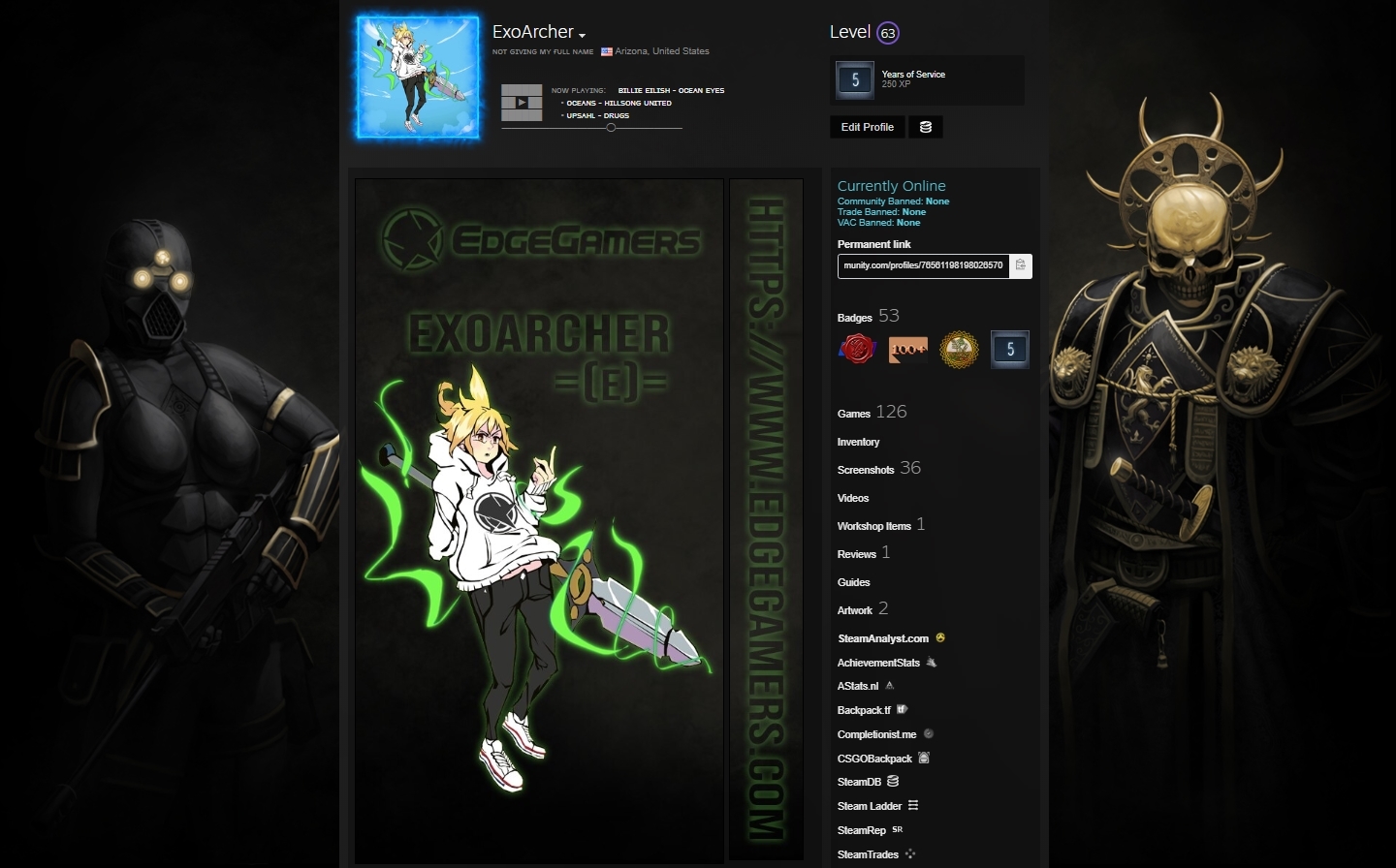
it looks really great, i love the hoodie lol, so cute. some constructive criticism
-I would remove the https://
-Possibly change font used for ur name and the link, makes the =(e)= look a little eh.
-Maybe shorten down the picture a bit, so there isn't as much extra space at the bottom.
But that's person to person stuff^ looks great, and keep up the great art!
heidi
i used that font for conformity. due to the font not having a lowercase version i wanted to just make it smaller. but im gonna go back and animate it later so ill decide if i wanna make changes
Update: i just realized i didnt save the psds.... F...