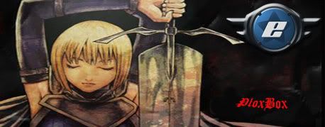
P PloxBox Poster Extraordinaire Joined Jun 28, 2009 Messages 2,138 Jul 16, 2010 #1 Well, i decided to play around with Photoshop CS5 and got the idea to make a signature, tell me what you think!
Well, i decided to play around with Photoshop CS5 and got the idea to make a signature, tell me what you think!
T TremendousLion Thread Junky Joined Feb 7, 2010 Messages 864 Jul 16, 2010 #2 Just Kidding. I like it, although I am not an advocate of the eGO symbol in signatures unless it is part of the design, or it flows nicely. Was this a render or just an image, because it looks a little low quality.
Just Kidding. I like it, although I am not an advocate of the eGO symbol in signatures unless it is part of the design, or it flows nicely. Was this a render or just an image, because it looks a little low quality.
P PloxBox Poster Extraordinaire Joined Jun 28, 2009 Messages 2,138 Jul 16, 2010 #3 Its the image. It was like that when i found it
B BrosKKi I made one post Joined Jul 17, 2010 Messages 8 Jul 17, 2010 #4 Thats not bad bro, you might wanna try a diff font though
Winston EGO Addict Joined Jun 9, 2009 Messages 1,336 Jul 17, 2010 #5 Maybe try smoothing out the sharp lines between the e symbol and the rest of the sig. Looks nice though
Maybe try smoothing out the sharp lines between the e symbol and the rest of the sig. Looks nice though
P PloxBox Poster Extraordinaire Joined Jun 28, 2009 Messages 2,138 Jul 17, 2010 #7 BrosKKi said: Thats not bad bro, you might wanna try a diff font though Click to expand... Alright, i'll consider that, i felt like using the same font style that is used on the Claymore anime cover (The image is from Claymore)
BrosKKi said: Thats not bad bro, you might wanna try a diff font though Click to expand... Alright, i'll consider that, i felt like using the same font style that is used on the Claymore anime cover (The image is from Claymore)
N Nightmare490 Thread Junky Joined Jun 7, 2010 Messages 779 Jul 17, 2010 #8 the image looks great like that! to me it seems like it adds an old medieval feel to go with the sword and stuff. idk thats my opinion xD
the image looks great like that! to me it seems like it adds an old medieval feel to go with the sword and stuff. idk thats my opinion xD
R Rogue205 Thread Junky Joined Jan 3, 2010 Messages 766 Jul 17, 2010 #9 Only thing i would suggest is to try and get the "e" and your name to match the fade of the original image.
Only thing i would suggest is to try and get the "e" and your name to match the fade of the original image.
Z Zeak(DK) EGO Zealot =(e)= Joined Jun 22, 2010 Messages 1,670 Jul 18, 2010 #10 What about doing something like this? __________________________________________________
P PloxBox Poster Extraordinaire Joined Jun 28, 2009 Messages 2,138 Jul 20, 2010 #11 But that totally eliminates the Old,Low quality feel of it that i was trying to achieve =/
G Geno EGO Zealot Joined Dec 7, 2008 Messages 1,719 Jul 22, 2010 #12 PloxBox said: But that totally eliminates the Old,Low quality feel of it that i was trying to achieve =/ Click to expand... why would you want it to feel low quality :confused1:
PloxBox said: But that totally eliminates the Old,Low quality feel of it that i was trying to achieve =/ Click to expand... why would you want it to feel low quality :confused1:
P PloxBox Poster Extraordinaire Joined Jun 28, 2009 Messages 2,138 Jul 22, 2010 #13 It's just the feel the anime gives off, even though its good
X Xhisorz Famous Joined Nov 27, 2009 Messages 576 Jul 26, 2010 #15 I like the 2nd more even tho you try to get the old medival style in it just looks better.