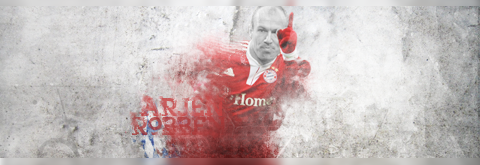
Thats pretty good work you go there if anything i would just make the sigs have a little less width lot of open space you know? Other then that they look great! I really like the first one!
You have potential, but what Kariak said, try to keep the render bigger, they have wayyyyyyyy to much "white space". Or you could do what Kariak's sig is like and keep it taller and smaller. Less white space. More action.
Not bad, definitely has potential. As stated, Sig size it too big (leads to lot of white space) and the render it too small. The Lasso tool (feather radius of 5-10) with Sharpen/blur is extremely useful for making things pop out more. Ditto with the burn and doge tools
EDIT:
Hope you dont mind, but I but I went ahead and made an example of those tools using the first sig you posted:
They are all pretty the same But they are nice.
I would suggest to have the main focus bigger..
Also try not to overeffect the sig, like the Snjeder sig (2)
They are bright, but thats allright if its not like the nr 2
+ It would be alot better to have background..like in the Fabregas sig(3) there is no background, ifthere would be a background..it would be alot better sig
hope i helped, any questions just message me


 so go easy on meh. I mainly do football(soccer) sigs.








 But they are nice.


