Rate the above users signature!!!*****

I don't like the black background but very nice deadmau5, looks high quality. 6/10
8/10 if it wasn't a black background.

That isn't actually black. It's brown.

Anyways. 7/10 It's a bit on the bright side. You have some ripples on beveled boarder around the circle. Color choice is a bit iffy. I don't like the shades of green with those blues. Has potential, just a few lil' fixes and it would be a 9/10 for that style of a sig.
 
7/10

I really like them individually, but together they're a little jarring with the different source material and line through the middle (plus scrolling).
 
sig 7/10, seems kind of simple, and the glow around the gun doesn't feel very glowy if you know what I mean
 
3/10
Too basic, and I'm not sure why post your phones screens. So much customizations out there with phones, it doesn't look like anything special. lol, sorry.

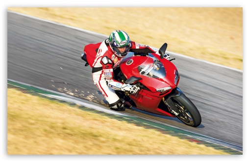
This was the original picture for my sig:
http://wallpaperswide.com/download/ducati_1198_superbike_superbike_racing-wallpaper-1920x1080.jpg
ducati_1198_superbike_superbike_racing-t2.jpg
 
Last edited:
6/10:biggrin: Simple yet elegant....

(just judge the first image)
 
1/10 cause it suckz

Just Kidding VeRtAgO =).
I'd say 8/10
1. It's Battlefield
2. The Background design is sweet
3. Has good colors that actually go together
4. Says Vertago
 
I'll say a 7/10. I like the simplicity and it reminds me of those ribbon dances.

(Also it saying Battlefield Division is a huge plus in my book)
 
Too many sigs... So cluttered... I like the bottom the best and give it 7/10.
 
5/10 seems too simple.....buuut

+1 for Bleach
+1 for Yachiru

so 7/10
 
3/5. Bit of a pain to update that sig it might be :P.

Not really a pain. Just save an image, open, copy, paste onto. :P

As for VeRtAg0 again... 8/10. The colors actually go nicely together and the pattern is cool.
 
Back
Top