
You are using an out of date browser. It may not display this or other websites correctly.
You should upgrade or use an alternative browser.
You should upgrade or use an alternative browser.
Rate the above users signature!!!*****
- Thread starter Blindsfell
- Start date




 )
)

- Joined
- Dec 10, 2009
- Messages
- 91
7/10 exactly what the other guy said.
Lame hitboxes.
Lame hitboxes.


- Joined
- Dec 17, 2009
- Messages
- 1,084
7/10 because im not really sure what the picture is of but your stats are good


- Joined
- May 13, 2009
- Messages
- 5,332
7/10 not bad!
- Joined
- Dec 10, 2009
- Messages
- 91
8/10 Love simple signatures.
Hoping next person knows who it is in my signature and will judge for techniques and look =p
Hoping next person knows who it is in my signature and will judge for techniques and look =p

- Joined
- Jul 2, 2009
- Messages
- 4,155
8/10
the flow seems a bit meh,
and the ink splats I'm guessing are a nice touch, making it look like an old photograph.
But the weird little light behind the cape is meh, and the text is just a tad bit too small. One more size up it would be good.
rate both please
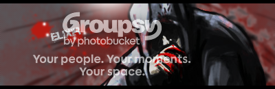
the flow seems a bit meh,
and the ink splats I'm guessing are a nice touch, making it look like an old photograph.
But the weird little light behind the cape is meh, and the text is just a tad bit too small. One more size up it would be good.
rate both please
Last edited:
- Joined
- May 13, 2009
- Messages
- 5,332
First one 6/10 just not really anything special about it.
Second 10/10 just wow it's awesome! wish it was a tad bigger.
Second 10/10 just wow it's awesome! wish it was a tad bigger.



- Joined
- Feb 25, 2008
- Messages
- 2,591
10/10 I like how you made the A like that, really suits the picture!



- Joined
- May 22, 2009
- Messages
- 2,152
10/10 very nice killzone, great colors! <3

- Joined
- Jul 19, 2008
- Messages
- 2,072
7/10 It's a bit plain, but interesting. Plus you didn't rate GodsAssassin.
EDIT: Sig changed...a bit.
Why do I always forget that? And I would like it to be explained how the text is out of place, so I can improve on the next one I do. The A thing is Earth's point of origin, which I looked up on google images because it fit with the theme.BreakPoint said:No border, and the text seems kind of out of place. the A thing looks cool, though.
EDIT: Sig changed...a bit.
Last edited:

Similar threads


- Replies
- 0
- Views
- 258
- Replies
- 8
- Views
- 316


- Replies
- 1
- Views
- 292

